

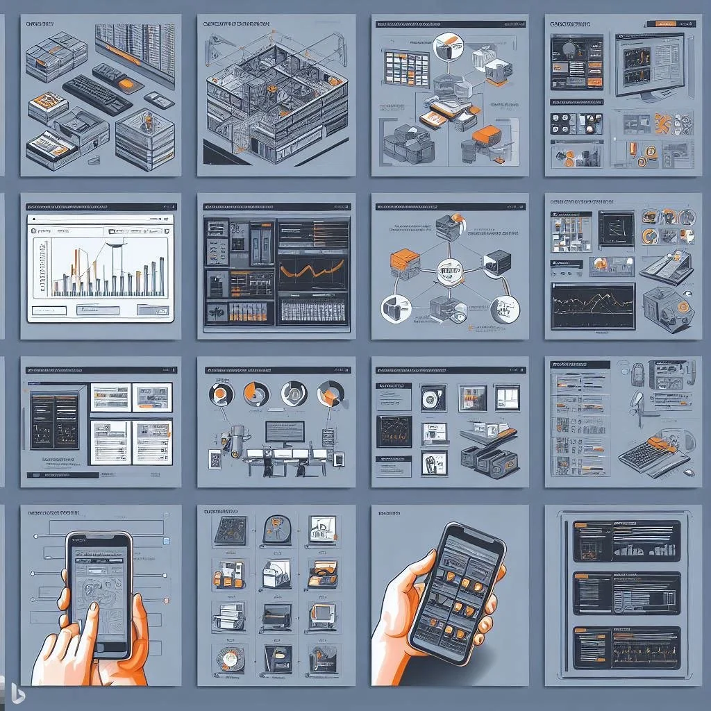


As data is becoming more of the central focus point for competitive advantage, many enterprises are seeking new ways to identify and analyze the data being generated. These enterprises use pie-charts, intuitive graphs, and various forms of visualizations to form a deeper analysis for their sales, revenue and other factors of company operations.
Although, a balanced approach with both data analytics and data visualization is necessary when formulating an effective data strategy. The reason being, the use of the data visualizations listed above, completely depends on how effective the data is or how the data is used to form conclusive decisions.
If you thought data visualization and analytics was one in the same- don’t worry, that’s a common mistake many enterprises make. The confusion stems from both aspects allowing users to understand the data and acquire the metrics, which assist in decision making.
As each year passes, more and more data is generated; causing information overload. The data being generated multiplies EVERY 3 years! So, you can understand why it is crucial to have the necessary resources to interpret all of that information.
On the other hand, this information overload isn’t so bad…
There’s quite a few projections showing an almost certain exponential growth in revenue for big data within the software market.
Are you still unclear on the difference between data visualization and data analytics?
Don’t worry, this confusion is common as we mentioned because both forms represent data in visual interfaces.
However, regardless of the similarities between the two, data analytics dives in deeper with data comprehension than data visualization. The pretty picture at the end is significant, but is definitely not the backbone - the tools and algorithms used to produce the final product is just as important (if not more)!
Confusion No More: Difference Between Data Visualization and Data Analytics

Let’s start with data visualization:
This is the representation of the data in visual form - making the trends and patterns essential in the data the central factor. If you’re using text-based data, such visualizations may not be possible or explicit to the data. As the traditional forms of visualizations are falling off the grid, such as line graphs, charts, and so on, 3D visualizations are taking their place. With 3D visualizations, users are able to manipulate the data with tools available through the application of filters.
Now let’s dive further into the world of big data. What does data analytics look like?
This aspect identifies and discovers new trends and patterns throughout the data. Although data visualizations allows users to understand the data, it doesn’t show everything. Visual representations can only be effective if the data being used to create the visualization is effective. So, what does that really mean?
If you’re inputting incomplete data into your visualization machine, then you can only expect a half complete representation of your data. What makes this EVEN more complex is the fact that enterprises are receiving data from multiple sources and storing this data into varying archives. This makes it more difficult to gather comprehensive data for data visualizations.
Visualization tools handle the fresh, raw, unformatted data, while analytics tools use data mining algorithms to properly clean and evaluate the data by using different evaluations and software resources. With the completion of this, you’re able to subject the data to algorithms and proceed with your decision on how to display your results.
First Step: Data Integration
In order to produce an effective analysis, it is required that you consolidate all the data into one space. There are of course analytical engines that collect data from multiple sources, however, by consolidating the data into one space; it provides you with one single version of “the truth”. This prevents the risk of duplication and contradicting information from distorting the visualizations.
With the continuous increase in data production, manual aggregation has become nearly impossible. Which is why, there are more and more releases of software tools and platforms available on the market - to provide you with an effective automated solution. These automated solutions clean your messy data, which would otherwise be inevitable with disparate sources and users.
Second Step: Data Analysis

After the cleaning process, the data is subjected to analysis and/or performance calculations on the data. With a growing business environment, data analysis is becoming more complex. With speed being the #1 necessity, multi-stage formulas have been integrated into the process which allow for multiple calculations to be done all at once. Data visualization involves reporting data rather than analyzing it and because of that, most tools are restricted when it comes to aggregations per formula.
This is why we have data analysis! It allows for users to create complex formulas, even while working in separate sources. The software proves to be useful as it takes the required pre-calculations automatically - saving you time.
Are you a business seeking success in today’s speedy world?
Consider analytics tools that update your data and facilitate collaboration. An analytical tool such as IBM Cognos takes your data and uses a plug-and-play structure to create colourful interfaces.
Many businesses within the retail sector are using data analytics to advance their processes and in turn, maximize their revenue. Data visualizations and analytics have assisted them in not only discovering new trends, but also have shown insights into customer behaviour, which help companies develop initiatives to achieve success.
Moreover, advanced analytics such as comprehensive business intelligence analytics suites, offer a predictive projection which is based on complex algorithms using languages like R and Python. Some of the key technologies used by business intelligence platforms are: dashboards, data warehousing, and advanced data visualization.
Always make sure that the solution provides you as the user, flexibility and ability to combine data in whichever way you need.
It’s also important you’re staying up to date and keeping up with the trends. The latest analytical platforms are using natural language processing along with chatbots to ensure users are easily able to perform calculations and input their inquiries without trouble. Some of the current advancements in the technology include location-based intelligence, which increases your chances of revenue through the use of analytics and customer insights.
The Last Step
Keep in mind that although the most effective visualization is based on analytics, the representation doesn’t always need to be the end of the process. It is common to take data analytics and visualization and throw them into a cycle.
If we look at machine learning and predictive modeling applications for example, the success of targeted emails depend on the cyclical process. Data visualization can start us off, followed by analysts putting specific variables into a graph in order to identify patterns or metrics, such as median averages, standard deviation metrics, and data spread. This helps you gain an understanding of your data.
Thus, it’s obvious that both analytics and visualization handle data. Data visualization creates a user-friendly guide to understand the report, but without cleaning the messy data and applying it to advanced algorithms, you will end up with more confusion than comprehension. This is where data analytics comes into play, while data visualization provides a summary of the data, the analytics provides the necessary tools for the correct portrayal of the data.
Incorporate both and you will receive the best possible software solution!
Are you struggling to keep up with the fast-paced growing exponential rates?
Let us help you, with insights, decision-making, efficiency and more!
