As we all know, the two major competitors when it comes to the mobile industry, are Apple (iOS) and Android (Samsung, Google, LG, etc). Both are equally successful, since they both offer similar features without being exactly the same. Which makes the mobile market a divided industry.
Regardless of the company, you work for, 9 times out of 10 nowadays you will be required to use some kind of app for multiple reasons. Most commonly businesses like to have an app that will tend to all of their pre-existing customers – which will mean it must be offered for both Android and iPhone.
As you design applications for both platforms, you will likely realize everyone has a preferred system – including yourself!
Here are the main design differences between iOS & Android:
General Style:
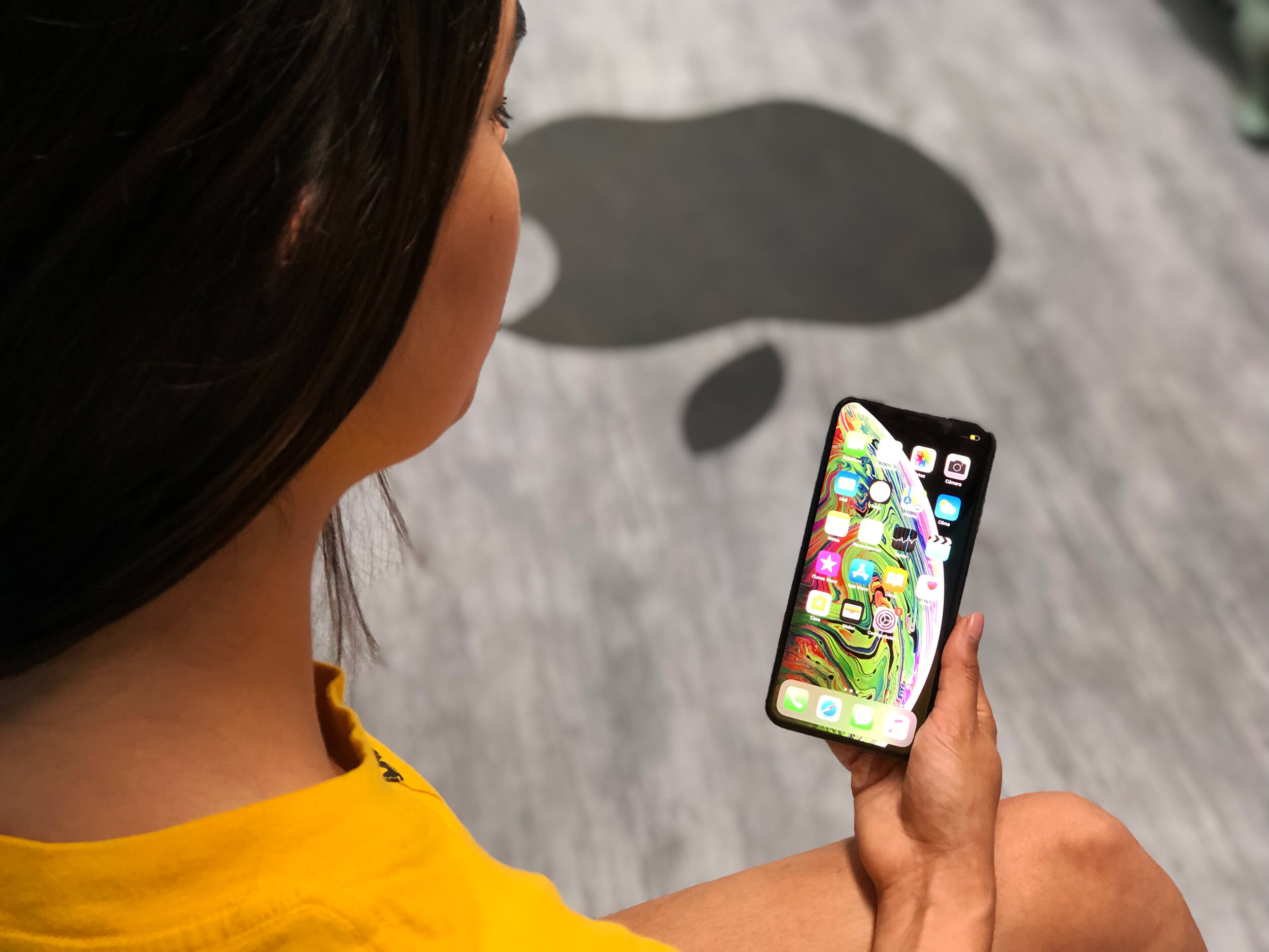
From the very beginning of Apple, they’ve always had a more aesthetically pleasing appearance, specifically iOS 7 – when they retired the appearance of shadows, textures and effects that took charge in the beginnings of Apple.
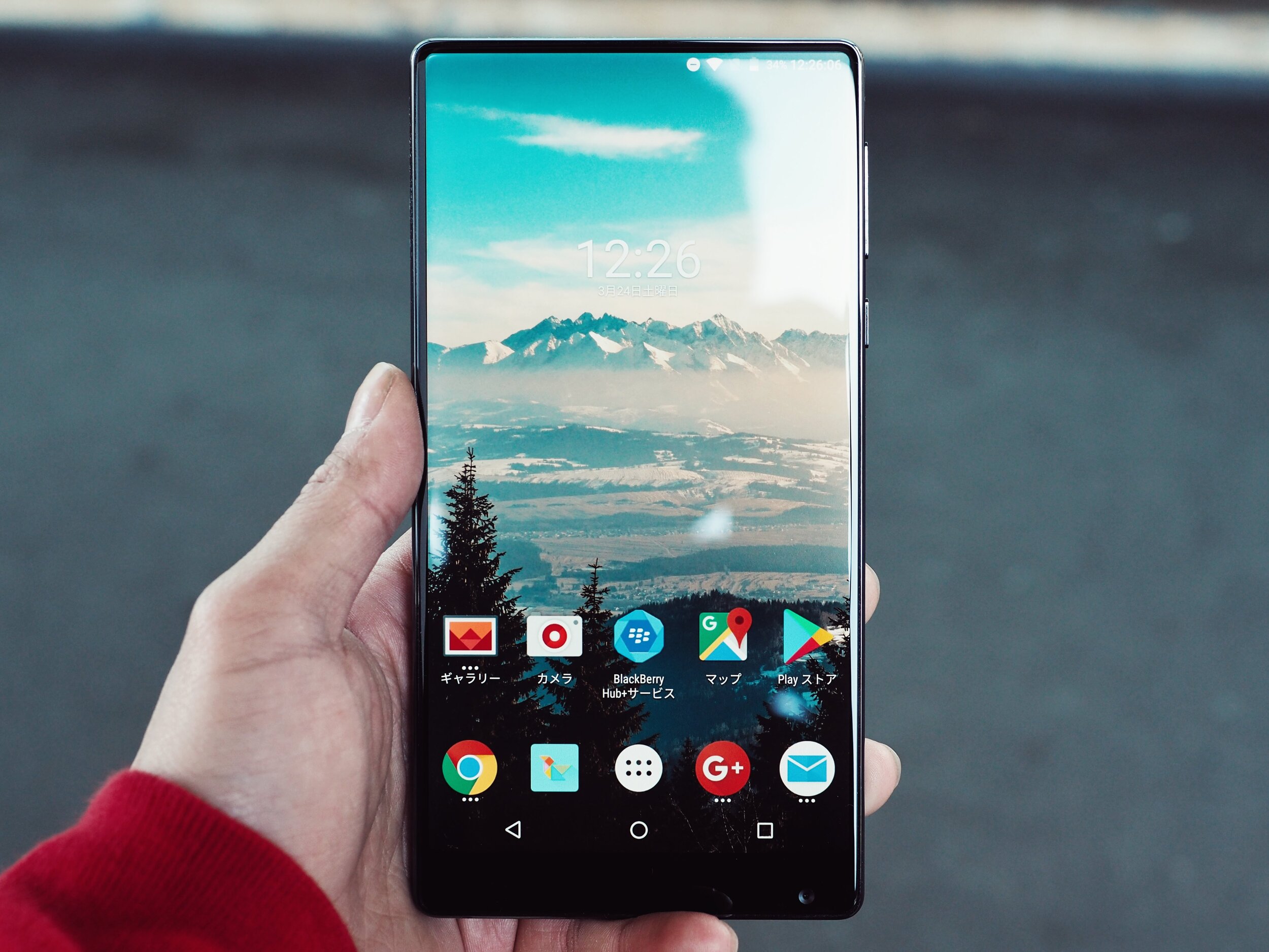
When it comes to general style Android has always had a more standardized characteristic, with an approach that is often called “layered paper” because of the design.
Real Buttons:
One of the biggest components that sets iOS and Android apart is that iPhones have never had a back button, which means that any app developed for iOS needed to have a way to go back to the previous screen. That often meant the inclusion of the “back chevron” in the top left corner of the page.
Needless to say, the iPhone has always needed the inclusion of a back option into their apps when designing, whereas Android has a back button integrated onto the phones that is used for going back, so you don’t necessarily need to put a back option into consideration when designing for Android.
Global Elements:
These are the features like the header, or a status bar, that are visible on every screen of your design. They are the one thing that should remain unchanged, especially if you want your app to have a natural feel for each platform it is corresponding to.
When it comes to iOS, the navigation bar always has the text centered, with several companies choosing to replace the title with their respective logo. The status bar that includes the carrier network, batter, and time, it’s the second thing that should remain unchanged. However, it should just have the respective design for each platform it is designed for.
As for the Navigation bar on Android, the text is always aligned to the left. As we know the text in the navigation part is often changed to the company logo for iOS, however this is not what is best when designing for Android.
Navigation:
The essential navigation arrangement has the tab bar on the bottom of the screen, which gives access to the top portion of the app.
With Android, the essential navigation arrangement is the drawer method, which is where users will go to find the menu items. This is often consistent on each page of the app.
Cards or Not:
When using digital design, Cards are an important component to it. The purpose of Cards is to enable users to gather quick snippets of content that are tailored to specific mobile development.
Designing using Cards for iOS, takes more planning because of the very specific pre-existing design style, since you don’t want too much contrast, especially when considering using shadow. It is recommended when using Cards for iOS to be as subtle as possible.
With Android, Cards will configure the design of their apps much better, especially when using drop shadows, as it will give the look of the apps a more native feel.
Typography:
Typically, the font family that is used for iOS is Helvetica Neue, and for Android the font family used is Roboto.
Typography is actually the category with the least amount of differences. Whether you are designing for Android or iOS, it is crucial to understand the base design aspects for each respective app, and operating system.
Ultimately, there are not very many big differences between iOS and Android, and it is recommended to try to design apps for both systems.
If you need help curating design features for one or the other, feel free to reach out to our experts at ISU Corp!


